Landing pages are the most effective way to get visitors to take a specific action.
Opt in landing pages try to get people to opt in to an emailing list. And if done well, they can do that very, very effectively.
But most opt in landing pages are so poorly written and designed that their conversion is minimal.
What’s your opt in landing page’s conversion? Is it 70%? Is it 50%? Is it even 25%?
Would you be willing to do some changes to double your conversion? Or to get even 10 more percents of visitors to opt in.
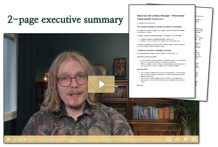
Here’s a video tutorial that explains the most common mistakes and shows you how to increase your conversion.
How to Build Opt In Landing Pages that Convert
The Key Points
1. Keep it Clean
A good landing page design is minimalistic. There’s only one natural direction where the visitor’s attention can go; and that’s towards your goal.
There are few if any links in the header. There’s no sidebar (usually). And all the text, graphics, videos, opt in forms, and other page elements are clearly separate.
2. Make a Promise
Your every visitor will ask this question when they see your page, “What’s in it for me?” They might not even notice doing it, but if they don’t get the answer immediately, they’ll leave.
Your headline should always make a promise about the value the visitor will get if they read on. You can use an indirect way to promise value, like asking a question about the topic you’re presenting. But the promise has to be there in one way or another.
Check out “101 Headline Formulas” if you need ideas about good headlines to use. It will also tell you what should come after each type of headline. (And it’s my highest converting opt in landing page at the moment ;) mostly because of targeted traffic, but still you can learn something from it.)
3. Offer Social Proof
There are several testimonials by readers on the example page (in the video). They’re there to put the visitor’s mind at ease; the visitor will know others are happy with their decision to subscribe.
If some of the people who have given you a testimonial are much better-known than the others, you should put their testimonials first. Testimonials are always helpful but when it comes from someone the visitor knows, it’s much more effective.
4. Explain The Value
“Subscribe to My Blog” doesn’t have any perceived value, unless the visitor already wants to subscribe before coming to your landing page. That’s not usually the case.
You’ll have to demonstrate the value they’ll get if they opt in.
The same is true for any freebies you may offer; they’re not worth an email address unless you prove their value. Use testimonials if you have them, and at least spell out the benefits the visitor will get.
5. Make Opting In Easy
Don’t force visitors to even scroll to find an opt in form. Put one to all key points when you feel the visitor may be ready to subscribe.
And don’t ask for any info you’re not sure you need. Asking just for a name and an email address is the standard, but you should consider asking for the email only; your conversion will (in almost all cases) go up.


